Web 2.0 Navigation System
September 20, 2010 1 Comment
I’m going to start a new series of tutorial for web designers to show, How to design a Web 2.0 website or page. Today I’ll talk about Web 2.0 navigation system , and in future we’ll have other elements, eventually we’ll have a conclusion with putting these tutorials together.
Each websites has its own navigation no matter how big or small it is. If you are a web designer or a mid-size corporation and want to create a new website, this article shows you a way to create a Web 2.0 navigation system.
Web 2.0 pages should be Simple, Clean, Focused and Easy to Browse. So to have all these option together, you have to know Web 2.0 website use a different style for navigation. Those use a top and some footer links for navigation. I really like this type of navigation system, especially those which use footer or fat footers; here is the reason for these locations.
- Top links: Main goal for your web site. It should contain at least 3 and at most 5 items.
- Fat Footer: Usually uses for sitemaps or for products or services which your corporation releases.
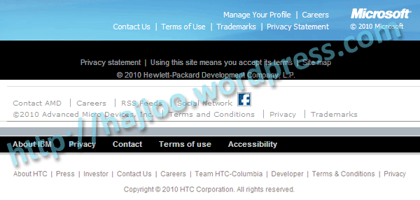
- Footer: mostly use for some information about your company or your main product/service.
Top Menu Items
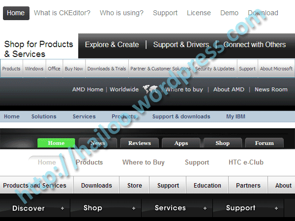
Based on your corporation size you have to use different items for Top Links, here are some of the best
- Small-size: Home or About Corporation – Products or Services – Support – Contact
- Mid-Size: Home or About Corporation – Products or Services – Partner or collaboration – News – CaseStudy
- Large-scale: Home – Products – Services – Connect – Support
As it is obvious (Home – Products/Service – Support) are main items which you mustn’t forget to put on your top links. Note that using a dropdown menu in Web 2.0 navigation is not recommended but a sub menu is always pleased. So if you want to add some items to your Products or Services, use a Sub menu system instead of a dropdown menu.
Fat Footer Items
I saw plenty of Web 2.0 websites with or without Fat Footer or even with different size (on height) of Fat Footer, so what’s the reason? When it is better to use a Fat Footer?
- Large-Scale: In most cases Large-scale corporations doesn’t use a Fat Footer and if it is so, there is an stylish Fat Footer just in a few pages not in all. So it shows that for large-scale corporation it is not recommended to use a Fat Footer and you have to use it in those pages which are the main pages, like Products or Services Pages, which related to some other pages and users may visits those pages too.
- Mid-size: It is necessary to use a Fat Footer for this type of corporations. It causes that users spend more time on your website. Mostly, all of the Services or Products lists in Fat Footer, and in some cases there are some links to some famous related reference; or even some famous customer or partner. It shows your reputation to visitors.
- Small-size: Depend on how your websites look likes, the items are different but it is recommended for small-size Corporation to use a Fat Footer. For instance if it is an official and serious website you have to act like Mid-size corporation. But if you have a friendly website you can put your entire sitemap on it.
Footer Items
Users like to know more about your company, its contact information and its support, so it is pleased to give them some information just next to CopyRight text, you can also add a sitemap, terms of use or privacy policy. Some cases also extend the footer by giving users a link to manage their profile.


